|
Contest Archive
The following contest is complete. The page has been protected and now serves as an archive. Do not edit this page.
Date completed: April 12, 2014
|
|---|
The final round of "Rename the Wiki" is currently underway, due to end on April 5, 2014. Click here to view and participate in that discussion. Due the overwhelming support for renaming the wiki to "Encyclopedia SpongeBobia," I anticipate that the final round will pass with ease. Therefore, in order to be ready for the official date of renaming (the wiki's 7th anniversary, April 25, 2014), we will hold a logo contest.
Contest
All are welcome and encouraged to participate. We will accept all logo ideas, concepts, and designs for submission. This includes ideas, especially if you are unable to do the design yourself. Please upload them to the wiki and link them on this page under your entry. Each entry will have their own section on this page. Below your entry, the community will discuss all concepts, with their support, oppose, or neutral opinion.
The contest will end on April 12, 2014 at midnight, eastern standard time. From there, the administration will take all ideas and concepts to develop the final logo. The administration may alter the logo as they see fit, from quality control, to design techniques, and dimensions of the image(s). Also, there might be the case of combining two or more different ideas into one logo concept.
- Timeline
- March 25, 2014 - Rename the Wiki (Final Round) and Logo contest begin
- April 5, 2014 - Rename the Wiki (Final Round) ends
- April 12, 2014 - Logo contest ends
- April 12-24, 2014 - the administration takes the entries to discuss and develop a final logo, after which the final logo is offically revealed.
- April 25, 2014 - the wiki's 7th anniversary; the new name and logo are made offical
Entries
Place your entries below.
AMK152

by AMK152
Like
![]() Like - It's plain, and not cluttered. Tan Ham Man
Like - It's plain, and not cluttered. Tan Ham Man![]() 21:20,4/6/2014
21:20,4/6/2014
Neutral
Dislike
Comments
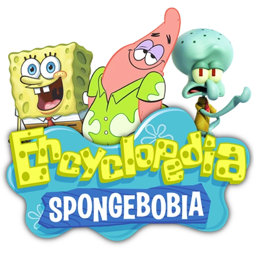
AW10
by AW10
Like
 Like - I like the use of the characters within the logo. — AMK152 14:10, March 25, 2014 (UTC)
- Like - Really really good. --Spongebob456 talk 18:04, March 25, 2014 (UTC)
- Like - Dude, this is the best logo I've seen! Tanhamman (talk) 23:06, March 25, 2014 (UTC)
- Like - I Really like it! HobbitsLover You've met with a terrible fate, haven't you? 20:22, March 26, 2014 (UTC)
- Like - Nice Logo & It Best. Blue99White 8:53 PM April 10 2014
- Like - I LOVE THIS! AwesomeAshley6199 (talk) 17:23, April 12, 2014 (UTC)AwesomeAshley6199
Neutral
Dislike
Comments
- Perhaps we could use the font from my design and combine it with the background behind "Encyclopedia SpongeBobia" on your design. — AMK152 14:10, March 25, 2014 (UTC)
- Perhaps even put the characters closer together (like them standing in a group) and include Sandy (which would cover the 7 main characters). — AMK152 14:10, March 25, 2014 (UTC)
- Actually, my font fits much better than yours, since the font you use seems "deformed" and my is "stable" and still looks Spongish [2]. AW10 Talk Contribs E-Mail 16:27,3/25/2014
- I have added Sandy. AW10 Talk Contribs E-Mail 18:49,3/25/2014
- Perhaps the text is too small for me to see the font. Any chance it could be larger? — AMK152 01:35, March 26, 2014 (UTC)
- I was thinking we could have a rather large logo on the homepage. — AMK152 01:36, March 26, 2014 (UTC)
- I will not touch the logo nor wiki-wordmark in any way, but I have created something to replace slider. [3] AW10 Talk Contribs E-Mail 07:50,3/26/2014
- Also, note that the ESB logo in the welcome box links to the Wiki History which is under construction. AW10 Talk Contribs E-Mail 08:12,3/26/2014
- Ah, that looks good. I can see the font better. I just want people to be able to read the name on the logo. — AMK152 15:03, March 26, 2014 (UTC)
- Also, I added more to the history, but it still needs more work from other perspectives. — AMK152 15:49, March 26, 2014 (UTC)
- I have changed the text-color of the "Encyclopedia" on the logo and on the wiki-wordmark and also left some black dots around the letters in small logo. This is the maximum level of readability I can reach for now. AW10 Talk Contribs E-Mail 17:37,3/26/2014
- I have also increased the distance between the characters and the logo in the wiki-wordmark. AW10 Talk Contribs E-Mail 17:55,3/26/2014
DJSponge

by DJSponge
Like
Neutral
Dislike
Comments
- Can you make the background transparent and also make a big version of the logo? AW10 Talk Contribs E-Mail 12:15,3/28/2014
Robuscus2013
![]()
by Robuscus2013
Like
Neutral
- Neutral - A bit too digital. Tan Ham Man 00:02,4/2/2014
- Neutral - I do like the "SpongeBobia" part. — AMK152 06:29, April 5, 2014 (UTC)
Dislike
Comments